Behind the scenes: The Branding of FlawTech America
FlawTech is a niche manufacturer of flawed welded specimens for the NDT industry. Their company was challenging to brand because we wanted to make sure FlawTech was represented as a serious contender in the industry while still helping it stand out from its competitors. FlawTech also wanted to make sure the new logo would be recognizable as the same brand.
Logo development
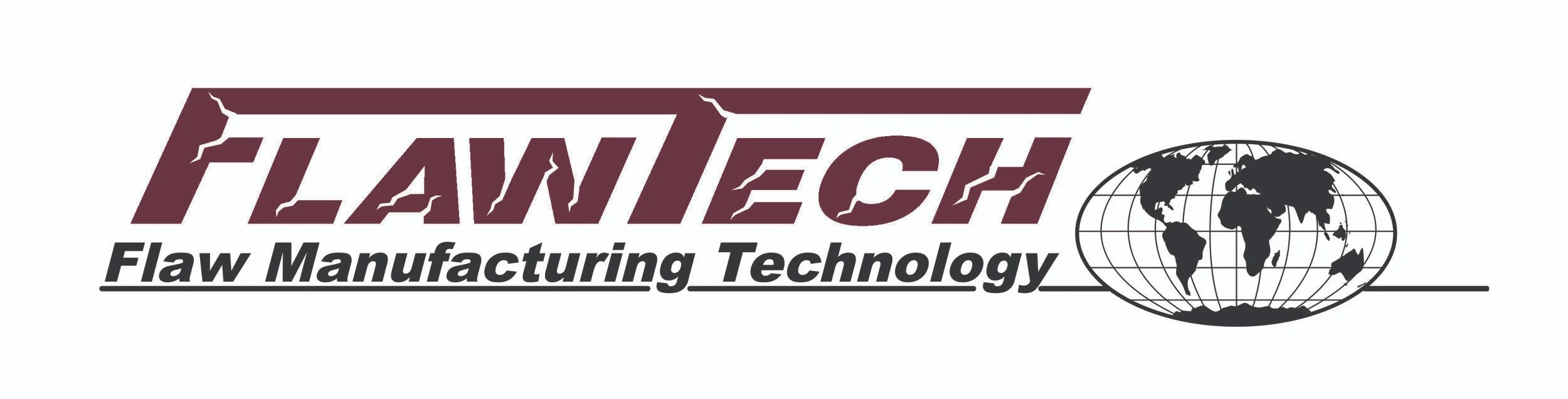
We decided to simplify the original logo (shown below) by removing the cracks and keeping the original frame. We also removed the globe and gave FlawTech a new color palette. These four new core colors have been used throughout the branding since and have names that fit well in the welding industry: Fume Maroon, Atomic Orange, Basic Black, and Welder Red.
creating an icon
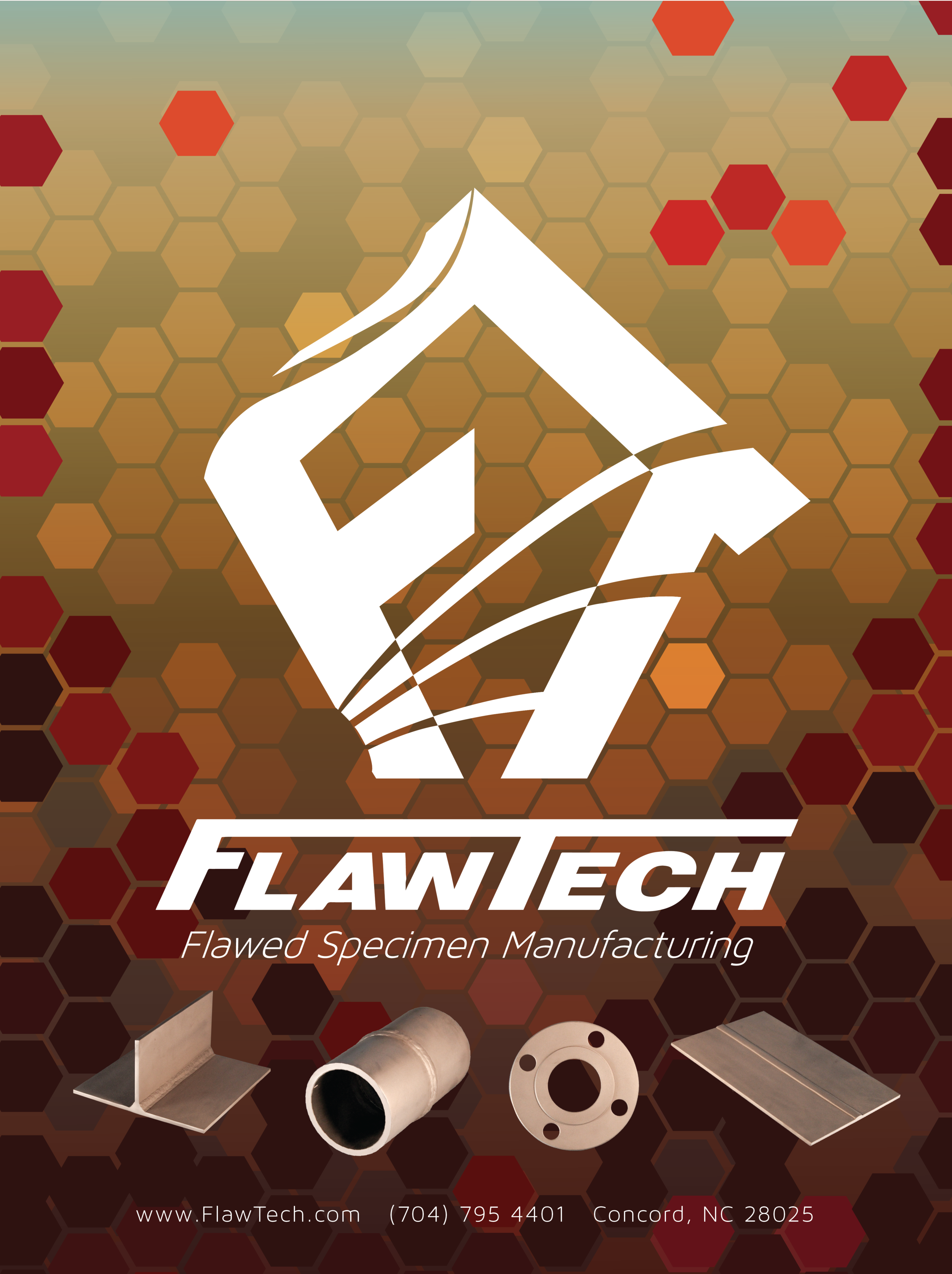
FlawTech needed a symbol to represent their company beyond just the title. Cicada Studios came up with the new icon below. It features the “F” and “T” of the FlawTech name and the profile of a welder’s hood looking left into sparks and smoke.
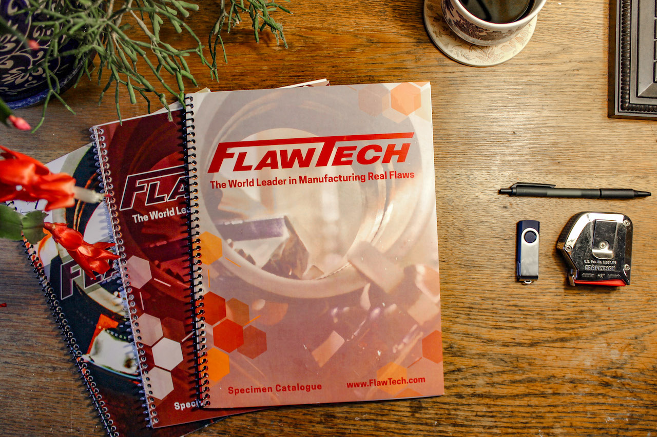
Along the way we were making edits to the company catalogue, the conference booth, employee head shots, the letterhead, product photos, the FlawTech website, and any other branding related item we could get our hands on. What has resulted is a strong brand that represents the intended message of the company. View more examples of the content created for FlawTech below and check out the FlawTech website at www.FlawTech.com.